Branding
The Sweet Retreat is a local bakery based out of Belleville, Ontario. The objective of this school project rebrand is to ultimately improve the perception of the chosen business. With a professional logo paired with a detailed brand guide and corresponding assets, The Sweet Retreat appeals to its target audience and increases interest in its products.
Branding
Logo Design
Packaging
Branding
The Sweet Retreat is a local bakery based out of Belleville, Ontario. The objective of this school project rebrand is to ultimately improve the perception of the chosen business. With a professional logo paired with a detailed brand guide and corresponding assets, The Sweet Retreat appeals to its target audience and increases interest in its products.
Branding
Logo Design
Packaging
The Process
The goal for redesigning The Sweet Retreat's brand was to make a cohesive identity for the bakery to be recognized by consumers. With a professional, well-crafted brand redesign, The Sweet Retreat will gain more brand credibility and be positioned higher in the market.


The Process
The goal for redesigning The Sweet Retreat logo was to implement a professional, clean look that is easily readable in various sformats while maintaining that creative, handcrafted, artisan feel.


With two concepts chosen, the next stage was to proceed with different typeface choices and look at colour palettes. Different Pantone colour swatches were chosen for each concept.
Distance and reversed readability were both tested during this time.
With two concepts chosen, the next stage was to proceed with different typeface choices and look at colour palettes. Different Pantone colour swatches were chosen for each concept.
Distance and reversed readability were both tested during this time.
Upon presenting to peers and receiving feedback from the professor, one concept was chosen to continue with to create the branding guide, stationery, and assets.
Upon presenting to peers and receiving feedback from the professor, one concept was chosen to continue with to create the branding guide, stationery, and assets.


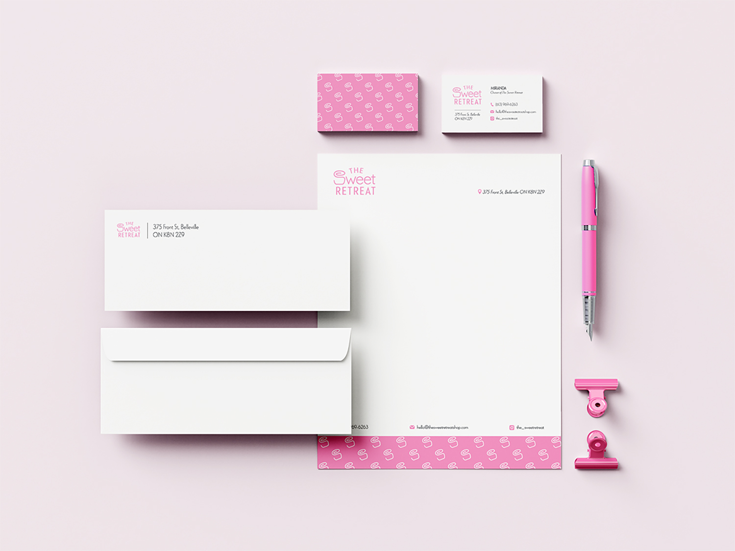
After extensive research, a brand guide was created to inform the imaginative client how to use their logo, tips, and dos and don’ts.
After extensive research, a brand guide was created to inform the imaginative client how to use their logo, tips, and dos and don’ts.

What's Included
The message behind the brand
Logo artwork for use in print and web
Pantone, CMYK, and RGB colour codes
Typeface and font alternatives for print, web, and accessibility
Backgrounds and contrast do’s and don’ts
Logo symbol and alternate designs
Logo reduction restrictions for logo variations and symbol
Buffer zone requirements
Digital assets (Icons, profile, and favicon)
Graphic treatment do’s and don’ts
Stationery, printing instructions, and stationery dimensions
Logo application examples
Photography tips
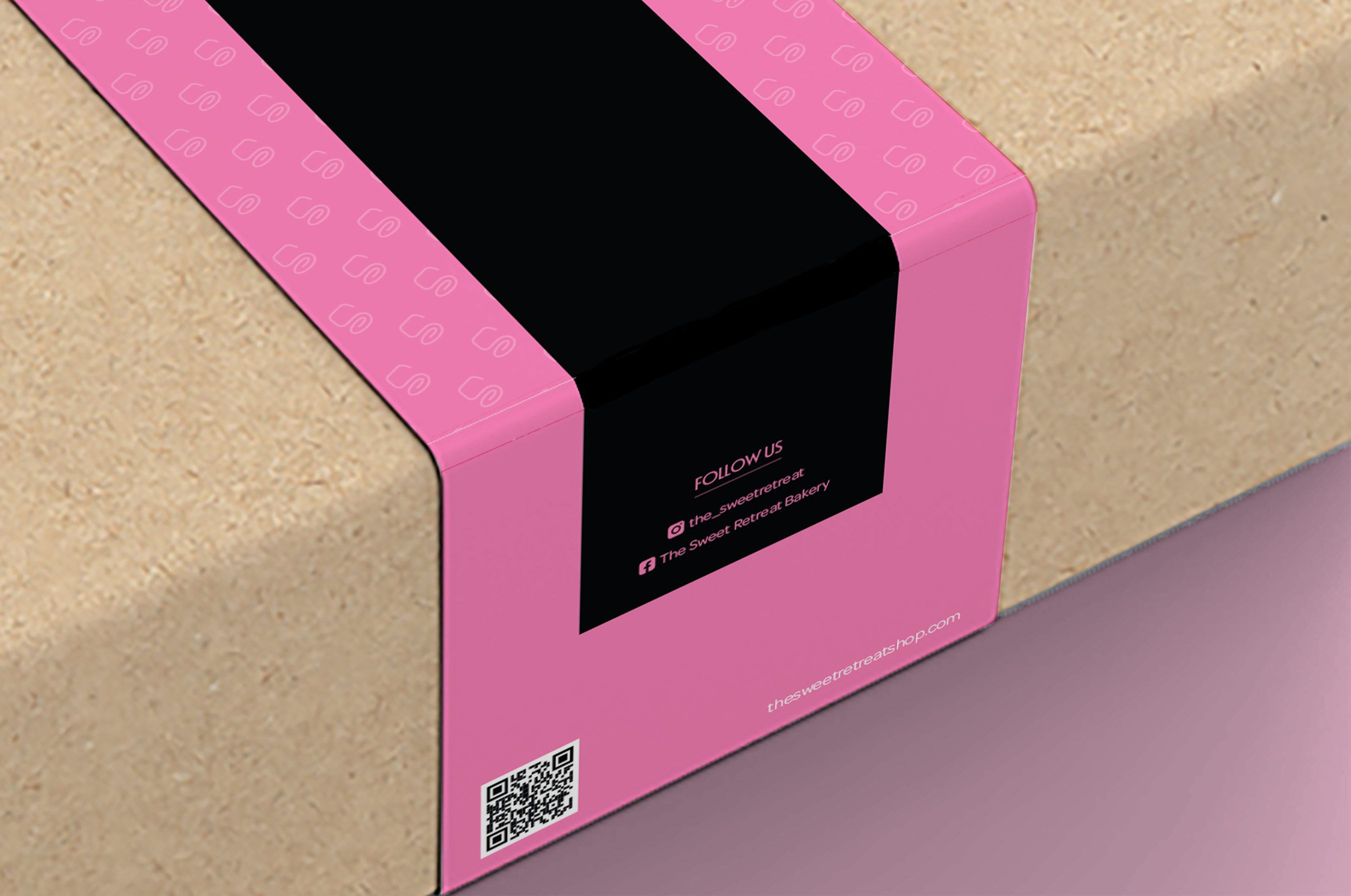
To increase brand loyalty and customer satisfaction, packaging for The Sweet Retreat was created for its baked goods and sweets.
During this portion, there were multiple stages of presenting to the professor and to classmates for critique. From there, adjustments were made to improve the design.
Initial design

Final dieline

To increase brand loyalty and customer satisfaction, packaging for The Sweet Retreat was created for its baked goods and sweets.
During this portion, there were multiple stages of presenting to the professor and to classmates for critique. From there, adjustments were made to improve the design.
Initial design
Final dieline

A custom sticker set was designed for The Sweet Retreat to use on their boxes in addition to the packaging sleeves, or in whatever way they can imagine!
A custom sticker set was designed for The Sweet Retreat to use on their boxes in addition to the packaging sleeves, or in whatever way they can imagine!